Klaviyo
Klaviyo is an AI-first B2C marketing/CRM platform that helps consumer brands turn their customer data into personalized email, SMS, and push campaigns. It supports fast-growing DTC customers like Glossier and Liquid Death to household names like Mattel.
2026
Product Design Co-op
Design Systems, Design Engineering, AI
Core Infrastructure
The Problem
Klaviyo stored content in flat, tag-based lists, so enterprise teams had no reliable way to organize or navigate large amounts of content. Product teams had started building one-off fixes, which created inconsistent patterns and growing UX debt.
The Solution
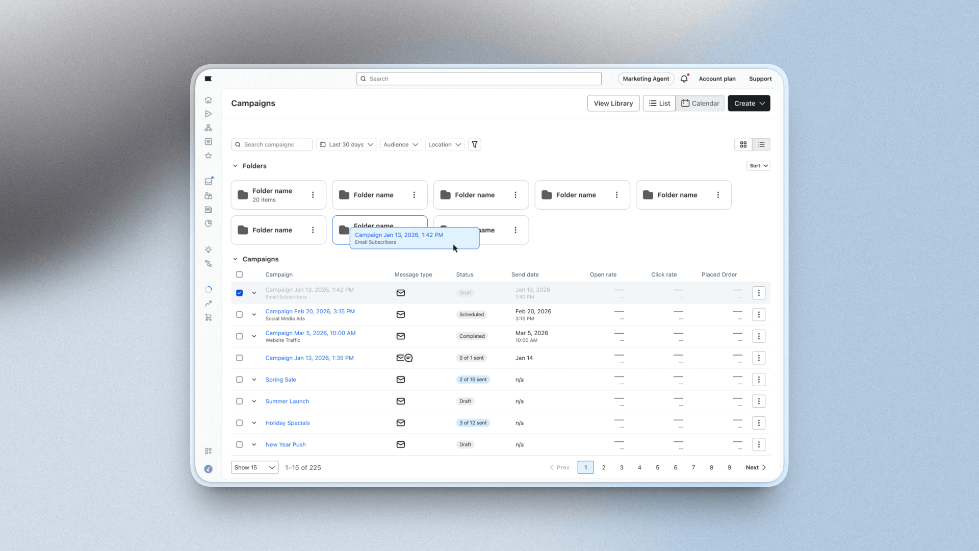
I researched and shipped a folder system, with pattern guidelines and four new components, that made hierarchical organization a platform-level pattern.
Folder patterns and components in production.
Key Contributions
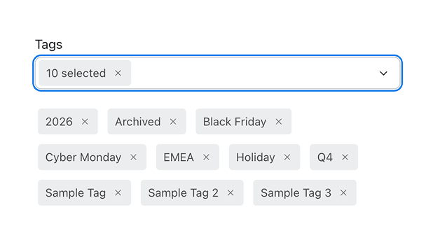
Simplifying load-bearing tags
Tags were used as both the metadata layer and the navigation layer. Because tags and objects are many-to-many, nothing had a single location in the interface, making content hard to index and keep track of. Folders absorbed the navigation use-case, giving every object one home and clarifying the role of tags.
Some of this work is proprietary! Please reach out for details, as well as information about other component projects.
AI Iteration
Pressure-testing the structure
→ Before handoff, I used a custom Figma MCP-Claude Code workflow to build all four components in staging so I could test how they fit into the existing platform.
→ It exposed gaps in our drag-and-drop library and where customizing it would hit its limits, and let me test how modular the content was and how easy the depth-based structure was to navigate.
Auditing hooks for accessibility
→ I had Claude audit our existing hooks package against what the new components needed for accessibility.
→ It flagged that drag and drop capabilities needed new hooks or alternatives to account for motor impairment and keyboard-only surfaces.
→ Focus management and ARIA were scoped before development instead of retrofitted.
Outcomes
Folders were reinstated as a platform-level pattern after deprecation, backed by published content hierarchy guidelines and new components.
Takeaways
→ Owning components from design spec through code review taught me to design with the technical build in mind. Knowing what's expensive to implement helped tailor my specs to our production code patterns.
→ Closing accessibility gaps at the folder component level fixes them across every surface at once, which incentivized a future accessibility hook package.
Retrospective
→ Depth-based content hierarchy fits enterprise needs, but depth introduces more places to look and more clicks to navigate. It is a trade-off that needs additional validation.
→ Bringing back a deprecated system meant first understanding why it was cut. The case for reinstating folders could only be made after I could show how the customer need had changed.